Storybook is an open source tool that organizes the development process and allows to develop one component in isolation during UI development. It offers support for many common frameworks like React, Angular, Vue or Web Components. Furthermore, a "live" documentation can be created and the stories can be used for testing. In recent years it has become an industry standard and has also replaced Ergosign's internally developed UX Library, which offered similar functionality for AngularJS and Angular.
The basic functionality of Storybook can be extended with so-called add-ons, so that the developers have additional tools at hand. For example, the Viewport add-on offers the possibility to quickly display the component in different browser sizes (smartphone, tablet, desktop).
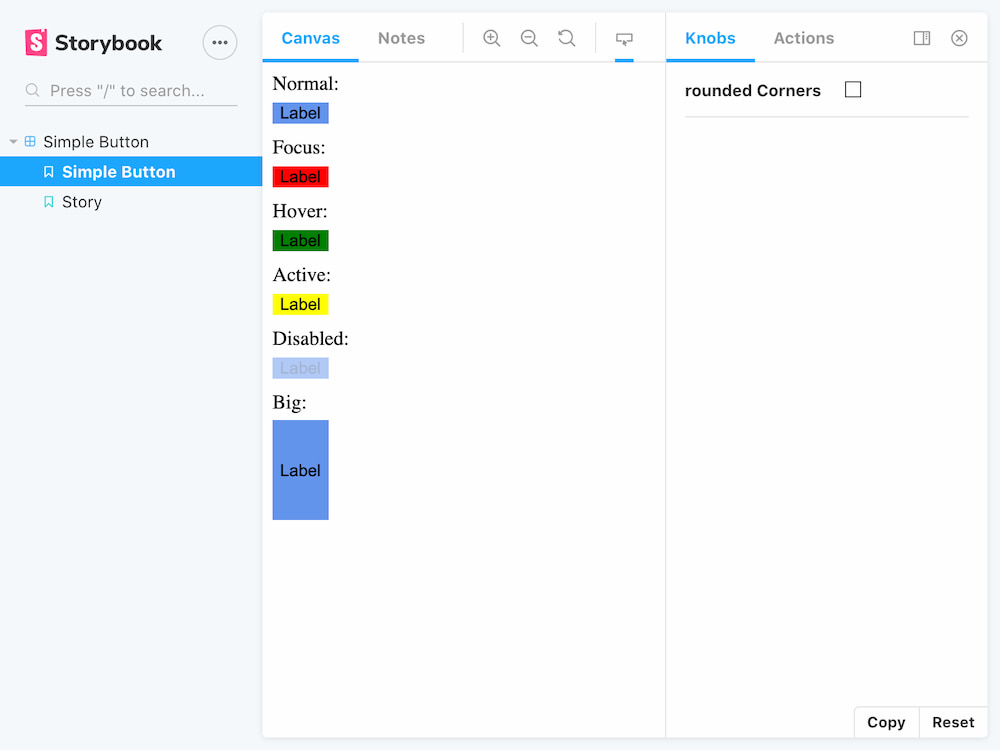
The Storybook Pseudo States Add-on extends the functionality of Storybook so that the component can be displayed in different pseudo states (:hover, :focus, :active, :visited, :dis-abled, :checked, etc) simultaneously. Furthermore, it's possible to force the styling of HTML attributes (readonly, valid, etc) as well as Javascript properties or framework specific declarative properties (selected, big-version, etc). Which status a component should display can be easily defined via a configuration in the related story.

This clear presentation makes it easier for developers to compare the design requirements. But it's also easier in design reviews because not all statuses have to be triggered manually. It also opens up the possibility to use tools for automated visual regression testing.
The development of the add-on has been started in August 2019 in the Focus Time at Ergosign and has been developed from October 2019 as part of my role as Technology Expert Web. Currently it is available as an open source tool in the Github repository of Ergosign for everyone in the community.
I also presented the tool at a web-worker meeting on the topic of storybook.